How to Read Crypto Charts
By Jason Miller – Crypto Writer 10.expert 🧠 Covering Bitcoin, altcoins, blockchain & Web3.
As a crypto writer and analyst, I can tell you that the crypto market, while often driven by news and sentiment, reveals its underlying story through charts. For beginners, the sheer amount of data on a trading chart can feel like deciphering an alien language. However, learning to read these charts is a fundamental skill for anyone looking to understand price movements, identify trends, and make more informed trading decisions. It’s not about predicting the future with 100% accuracy, but about understanding probabilities based on historical price action.
Let’s break down the essential components of crypto charts and how to interpret them.
How to Read Crypto Charts: Your Visual Guide to Market Action 📈📊
Every crypto chart tells a story of supply and demand, buyer and seller psychology, and market momentum. Learning to decode this story is the first step toward becoming a more effective trader or investor.
Understanding the Axes: Price and Time ⏰💲
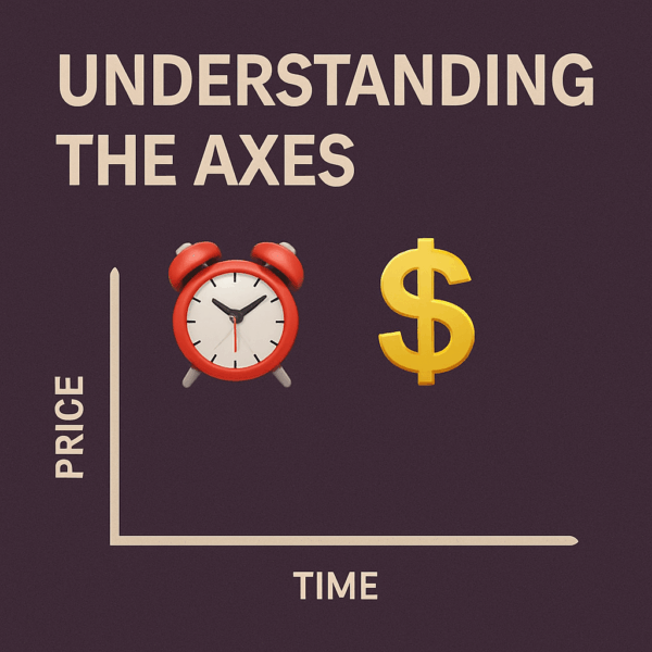
The most basic elements of any chart are its axes:
* X-axis (Horizontal): Represents time. Moving from left to right means moving forward in time. You can adjust the timeframe (e.g., 1-minute, 1-hour, 1-day, 1-week) to suit your analysis.
* Y-axis (Vertical): Represents the price of the cryptocurrency, typically against a fiat currency (like USD) or another crypto (like BTC).
Candlestick Charts: The Trader’s Favorite 🕯️
While line charts and bar charts exist, candlestick charts are the most popular and provide the richest information for traders. Each “candlestick” represents the price movement for a specific timeframe (e.g., if you’re on a 1-hour chart, each candle shows 1 hour of price action).
Anatomy of a Candlestick: Body and Wicks
Each candlestick has two main parts:
* The Body: Represents the range between the opening and closing prices for that period.
* Green/Bullish Candle: The closing price was higher than the opening price. The bottom of the body is the open, the top is the close.
* Red/Bearish Candle: The closing price was lower than the opening price. The top of the body is the open, the bottom is the close.
* The Wicks (or Shadows): The thin lines extending above and below the body.
* Upper Wick: Shows the highest price reached during that period.
* Lower Wick: Shows the lowest price reached during that period.
Volume Bars: The Strength of the Move 🔊
Below the main price chart, you’ll usually find a volume chart represented by vertical bars.
* Green Volume Bar: Indicates higher buying volume (often corresponds with a green price candle).
* Red Volume Bar: Indicates higher selling volume (often corresponds with a red price candle).
* Interpretation: High volume accompanying a price move (up or down) suggests conviction behind that move. Low volume might indicate indecision or that a move is not sustainable.
Market Capitalization: The Size of the Crypto 📊
While not directly on the chart itself, market capitalization (market cap) is a crucial metric often displayed alongside charting data. It’s calculated as: Current Price x Circulating Supply.
* Higher Market Cap: Generally indicates a more established and stable cryptocurrency (e.g., Bitcoin, Ethereum).
* Lower Market Cap: Often associated with newer, smaller, or more volatile projects.
Trends: The Direction of the Market 📈📉
Identifying trends is fundamental.
* Uptrend: Characterized by higher highs and higher lows. The price is generally moving upwards.
* Downtrend: Characterized by lower lows and lower highs. The price is generally moving downwards.
* Sideways/Consolidation: The price is moving within a relatively narrow range, indicating indecision or accumulation/distribution.
Support and Resistance Levels: Price Magnets 🧱
These are key price levels where the asset tends to find buying (support) or selling (resistance) pressure.
* Support: A price level where buying interest is strong enough to prevent the price from falling further.1
* Resistance: A price level where selling interest is strong enough to prevent the price from rising furthe2r.
These levels often act as psychological barriers and can indicate potential reversal or breakout points.
Trendlines: Connecting the Dots 📏
Drawing trendlines can help visualize trends:
* Uptrend Line: Connects a series of higher lows.
* Downtrend Line: Connects a series of lower highs.
A break above an uptrend line or below a downtrend line can signal a potential trend reversal.
Moving Averages (MAs): Smoothing Out the Noise 🌊
Moving averages are lines plotted on the chart that represent the average price of an asset over a specific period (e.g., 50-day MA, 200-day MA). They smooth out price fluctuations and help identify the overall trend.
* Golden Cross: A bullish signal where a shorter-term MA crosses above a longer-term MA.
* Death Cross: A bearish signal where a shorter-term MA crosses below a longer-term MA.
Relative Strength Index (RSI): Measuring Momentum 💪
The RSI is an oscillator (typically plotted below the price chart) that measures the speed and change of price movements. It ranges from 0 to 100.
* Overbought (above 70): Suggests the asset may be due for a pullback.
* Oversold (below 30): Suggests the asset may be due for a bounce.
Moving Average Convergence Divergence (MACD): Trend and Momentum ↔️
The MACD is another popular momentum indicator that shows the relationship between two moving averages of an asset’s price. It consists of a MACD line, a signal line, and a histogram. It helps identify trend changes and momentum shifts.
Common Candlestick Patterns: Signals of Change 🧩
Certain combinations of candlesticks form patterns that can hint at future price movements.
* Doji: Small body, long wicks, indicates indecision and potential reversal.
* Hammer/Hanging Man: Small body, long lower wick, indicates potential reversal (bullish at downtrend bottom, bearish at uptrend top).
* Engulfing Patterns (Bullish/Bearish): A large candle completely “engulfs” the previous smaller one, signaling a strong reversal.
* Morning Star/Evening Star: Three-candle patterns indicating reversals.
Chart Patterns: Larger Formations 📐
Beyond individual candlesticks, prices often form larger patterns that can indicate continuation or reversal.
* Triangles (Ascending, Descending, Symmetrical): Consolidation patterns that often lead to a breakout.
* Head and Shoulders (and Inverse): Classic reversal patterns.
* Double Top/Double Bottom: Indicate reversals after two failed attempts at breaking a resistance/support level.
Multiple Timeframes: Zoom In and Out 🔬
Always analyze charts across different timeframes. A daily chart gives you the big picture trend, while an hourly or 15-minute chart can help you pinpoint entry and exit points within that larger trend. This provides context and reduces false signals.
Practice and Patience: The Keys to Mastery 🧠
Reading crypto charts is a skill that improves with practice. Don’t expect to master it overnight. Start by observing, backtesting (looking at past data to see how patterns played out), and practicing with small amounts. Combine technical analysis with fundamental analysis for the best results.
By diligently studying these elements, you’ll gain a deeper understanding of market dynamics and be better equipped to navigate the volatile yet exciting world of crypto trading.


